Something years of working on marketing materials has taught me: always picture where someone will be when they see your finished work.
It’s surprisingly easy to forget that when you’re fine-tuning at 400%.
It might be a poster behind a reception desk, or beside a major road where your audience is concentrating on actually driving.
It might be in a waiting room, competing with a leaflet about verrucas, or on a phone being scrolled between bites at lunchtime.
Same campaign in very different circumstances.
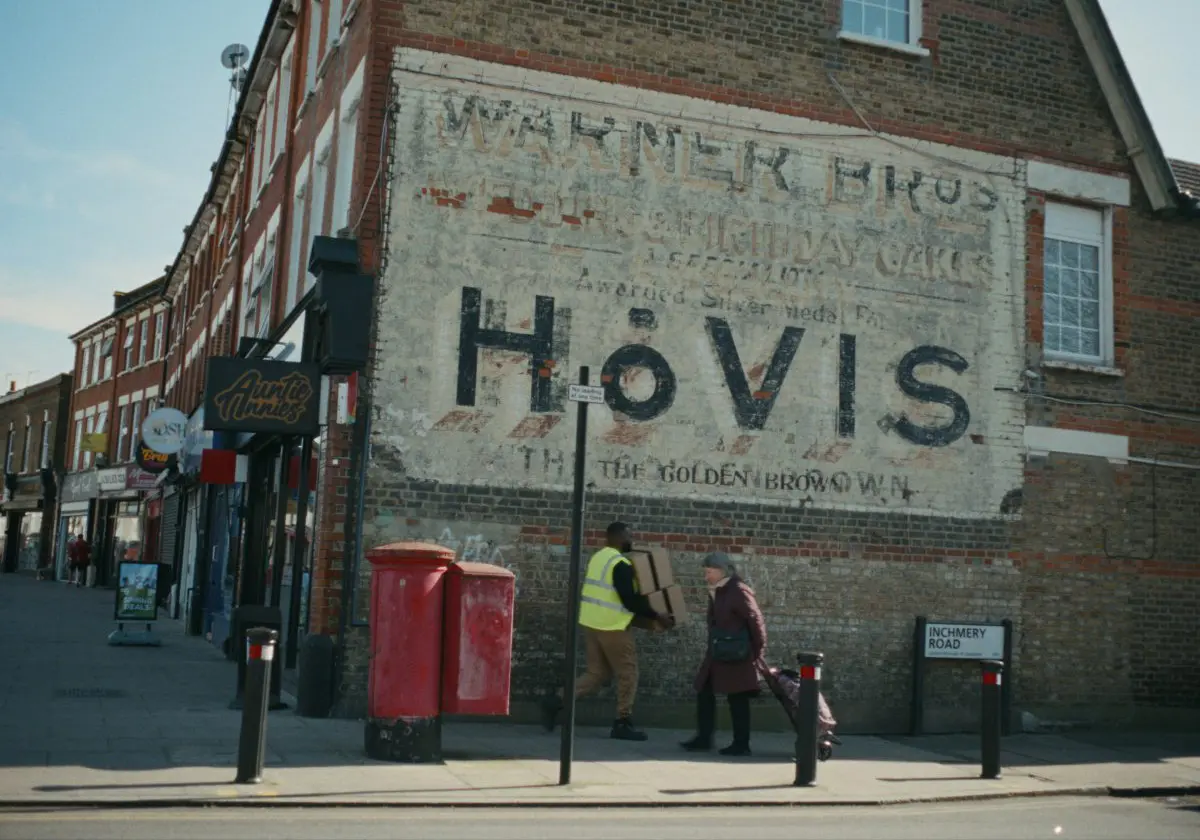
A 48-sheet roadside poster has a fleeting opportunity to land a message. One clear thought and something to catch the eye. There’s only so much it can reasonably ask of a passing driver.
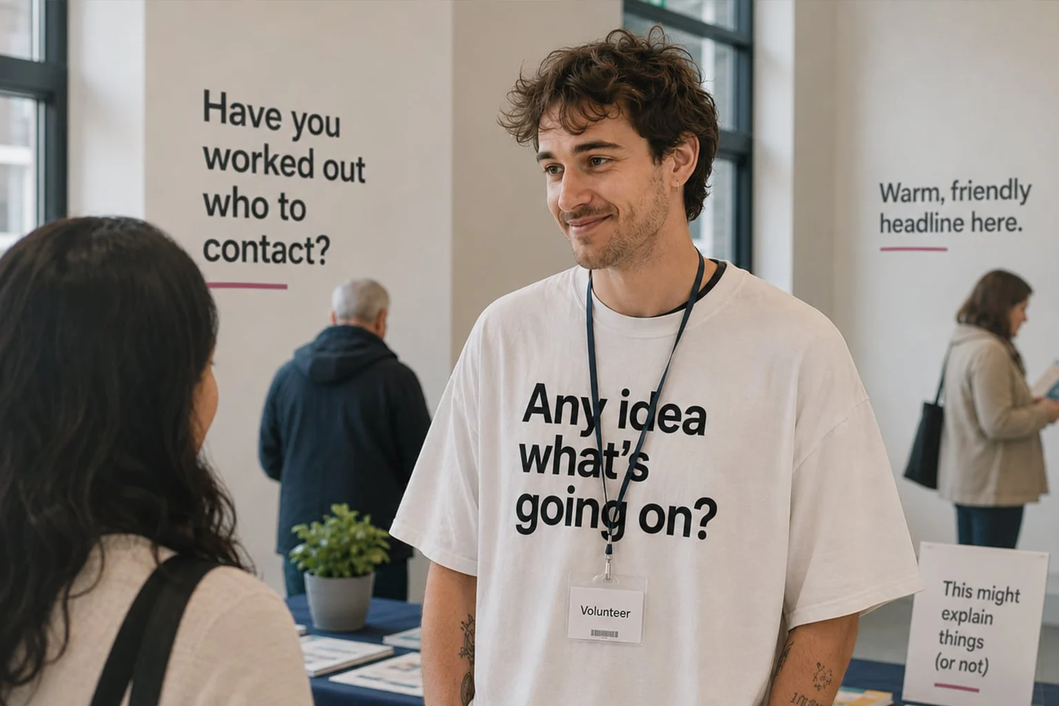
A waiting room poster still needs to grab attention, even if its audience has another twenty minutes of captivity. It can reward a second look with a bit more detail, but that’s still not an invitation to include the company’s life story.
The doom scroller needs a reason to stop. Once you’ve earned that pause, more information can be a click or a swipe away.
The context should shape the message, the hierarchy, the type size, the imagery and how much you ask people to read. Try to say everything and you risk communicating nothing.
Also, be clear about what you want people to do next, whether that’s read more, visit somewhere, or simply remember you.
So, before signing off, step back. View it at a realistic size. Put it on a phone. Stand across the room. Give yourself a passing glance rather than a leisurely inspection.
Can you tell what matters? Can you read what you need to? Does it give you a reason to look again?
Good design needs to work where people encounter it. Even when they’re thinking about verrucas.
Let's talk.
FREE DISCOVERY CALL
Click below to arrange a chat with Peter to
see how we can maximise your marketing.