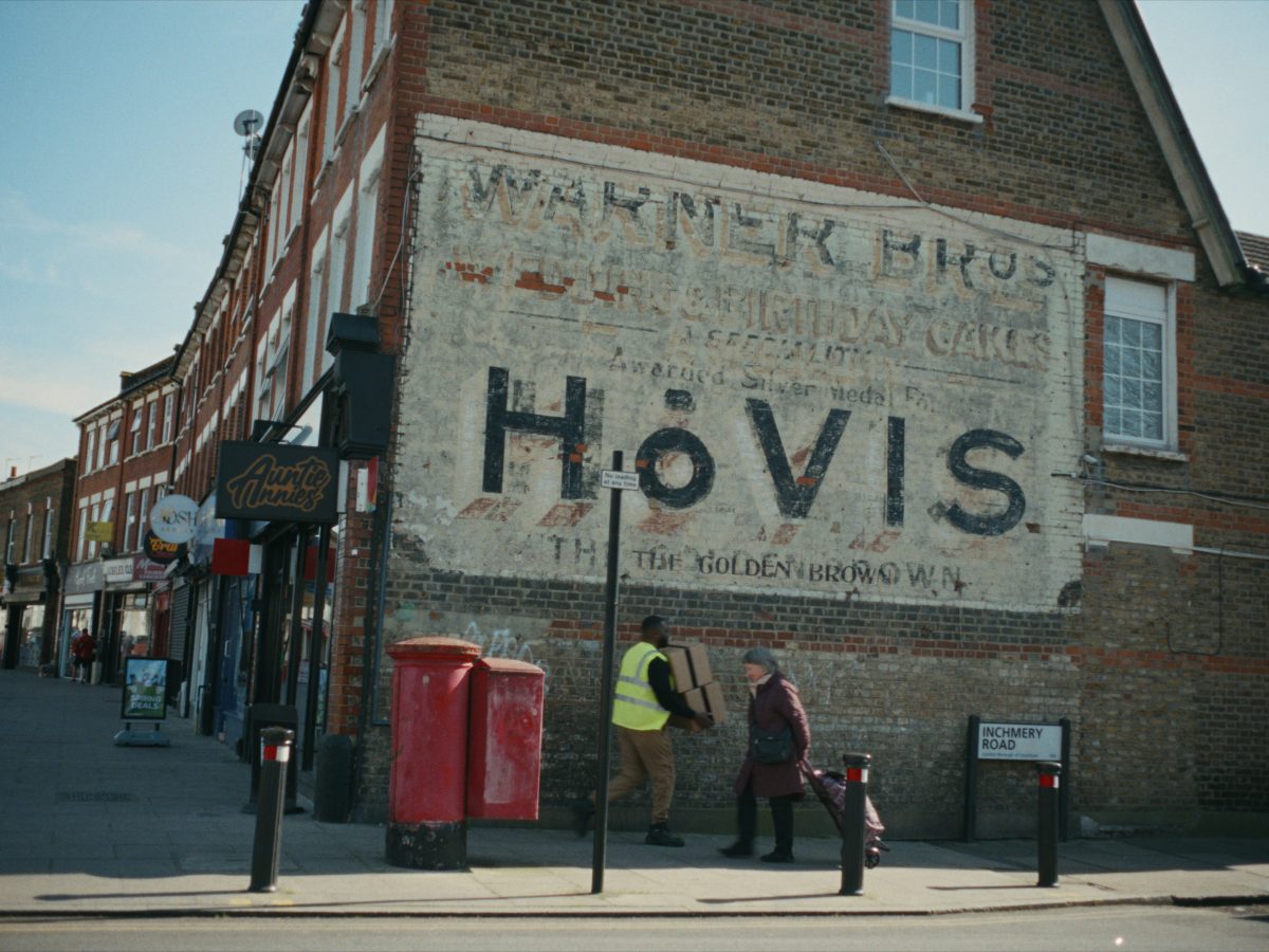
Hovis has just launched a new campaign built around old painted adverts on the side of buildings.
It immediately got my attention because I love these ‘ghost signs’. Faded lettering, all hand-painted with old slogans still clinging to brickwork decades after the campaign (and in many cases after the brand).
The Hovis idea works beautifully because it uses these old signs to say something bigger about the brand itself. Hovis has been around for generations, so the faded brickwork isn’t just nostalgia, it’s evidence. We were here then, we’re still here now, and we’ve been baking your bread all the way through.
The campaign also got me looking for more ghost signs, and you see them everywhere. Some are still surprisingly legible while others are barely there.
I love the old typography and signwriting, and how they’ve become more than adverts, they’re part of the building now, and part of the local landscape. A piece of history that happens to be trying to sell you bread, razor blades or some questionable digestive aid from 1927.
There’s something brilliant about advertising that has outlived the campaign, the shop it was painted for and probably everyone involved in approving it. Unlike most modern advertising, these weren’t endlessly resized into templates. The wall was the format. The signwriter had to make the type, scale and layout work for that exact building. Which is probably why so many of them are brimming with character.
Oh, and before I forget, can we all agree never to paint over them?
I’ve collected a few surviving examples and hidden enough of each to test you. Some are easy but how many brands can you name?
Let's talk.
FREE DISCOVERY CALL
see how we can maximise your marketing.