I haven’t thought this seriously about Monster Munch since I was about 11.
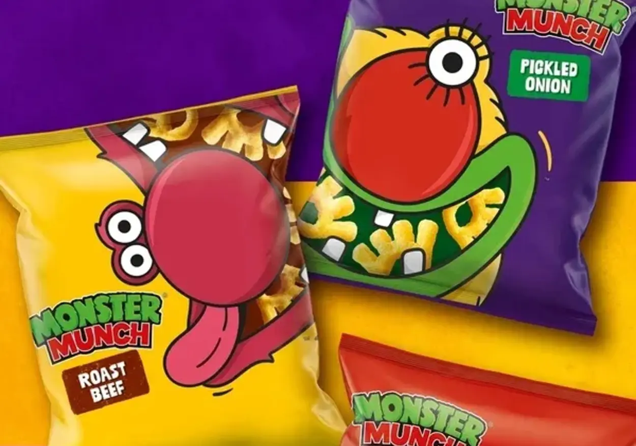
But I really like the new packaging from Walkers Crisps UK. The monsters look great, and more importantly, the redesign seems to understand something brands often forget: if people already love or instantly recognise an asset, don’t replace it. Use it.
The new packs bring the monsters right to the front, simplify the illustration style so they’re more iconic, and let the characters do more of the work. Jon Bailey at PepsiCo described it as “carefully updating our beloved Monsters”, which feels like exactly the right brief. They feel closer to the older, bolder versions people remember, without simply turning the whole thing into a nostalgia exercise.
It makes total sense to me. Those characters have been around for decades. For a lot of people they’re tied up with childhood, lunchboxes and the radioactive joy of crisps that leave your fingers smelling of seasoning for the rest of the afternoon.
That kind of familiarity is a genuine brand asset. And yet rebrands often want to prove they’ve changed something. New symbol, new typeface, new story, new everything. Sometimes the smarter creative decision is to recognise what already has value, strip away the clutter around it and let it work harder.
That’s what I like here. The monsters already had personality, instant recognition and sentimental value. The redesign hasn’t tried to be too clever. It’s just given them more room.
More importantly though, what’s the best Monster Munch flavour?
Roast Beef. Obviously.
Let's talk.
FREE DISCOVERY CALL
see how we can maximise your marketing.