

Logo similarities are more common than you think
– but where’s the line?
Famously, the line was crossed by the first 2020 Tokyo Olympics logo, and embroiled in a copyright row with Belgian Théâtre De Liège. After initially defending the logo, the organising committee withdrew it amid further allegations aimed at designer Kenjiro Sano. As it goes, the eventual Tokyo Olympics logo by a Asao Tokolo was a huge improvement, and more representative of Japanese culture.

Airbnb’s symbol – derided by many with suggestions it resembled sexual organs – certainly did resemble Azuma, a 1975 Japanese Drive-In logo. The design was explained via an equation as representing People, Places, Love, and a cap A, perhaps to demonstrate their thought process and its originality.

Some logos are deliberately similar – Chinese electrical goods feature a China Export logo which has a confusing resemblance to the Conformité Européenne logo which certifies a given product complies with all relevant laws for sale in the European Area. Although I’m not sure whether to applaud or be appalled, I think the line has been crossed by a distance.

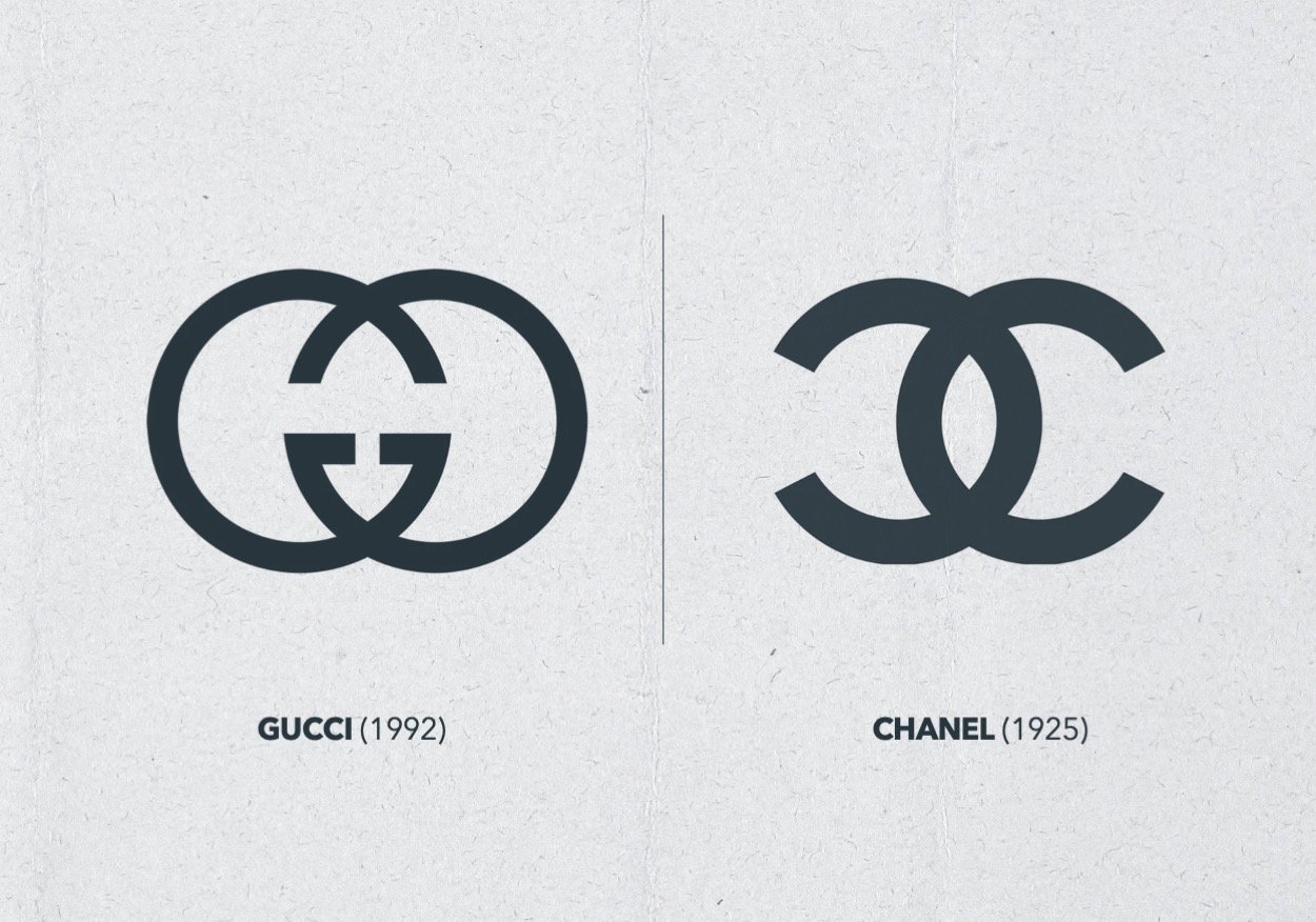
Proving plagiarism is difficult. In some cases, each designer may have followed the same thought process independently and not know of the logo-a-like’s existence. By their nature, logos are memorable, so open for subconscious mimicking, and the simpler a design, the more likely it is to resemble another. While most designers will look at logos for inspiration, I doubt any designer with integrity will deliberately copy another’s work.
That’s because a logo is a visual representation of a brand, and brands are defined by their name, personality, tone of voice, audience, USPs, goals, manifesto, vision… It’s unlikely that this definition exactly matches another. Therefore, a logo should strive to be unique too.

However, such desire shouldn’t come at a cost; Designer Paul Rand emphasised the importance of good design over solely focusing on originality. I get his point, good graphic design is an exercise in comprehension; its purpose is to trigger recognition, so a new logo needs to have a level of familiarity. Filmmaker Jim Jarmusch said, “Authenticity is invaluable; originality is non-existent.” He encourages artists to “steal from anywhere that resonates with inspiration or fuels your imagination” which suggests that true value lies in how an artist reinterprets and combines existing elements. I don’t believe that’s an endorsement for AI design or stealing – the key ingredient is human imagination. We Are Acuity undertake a lot of research before we design a logo. We look at what defines the brand, and we talk to the people who will drive it. If this process is followed, the result is authentic and as original as it can be, or it’s coincidently similar.
We’ll happily prove our Branding credentials – get in touch if you’re looking for help with yours.


