
OK, who wants to dive into a fastidious post about punctuation?
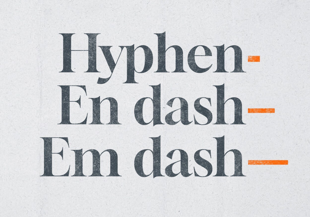
For those who are still reading, do you know the difference between a hyphen, an En dash, and an Em dash?
Well, it’s width. But each are used for different tasks.
Starting with the shortest, a hyphen is used to connect compound words like eye-opener and know-it-all, and there's a key for it on everyone's computer. Hyphens are used because they’re short, so the words are closer together and the reader isn’t going to pause. Hyphens are not used to indicate a range – that’s the job of an En dash…
En dashes are so-called because they’re about the width of an upper-case N. Pages 32–33, and February–March are separated by En dashes because the dash is used in place of the word to. Similarly, writing scores such as Liverpool won 4–0, or noting conflicts like UK–US English differences, and prefixing compound nouns like ex–Mother-in-law – all use En dashes without spaces. You can type an En dash by keying [alt] [hyphen].
Then there’s the Em dash (typing two hyphens often gets converted to an Em dash). Em dashes are about the width of an upper-case M—and seem to be appearing everywhere these days—in this context and without spaces. As I understand it, it’s an American thing; they use them instead of semi-colons, commas, and parenthesis. Em dashes work better than commas to set apart a unique idea from the main clause of a sentence, but UK English prefers to use the shorter En dash with spaces either side – because it looks cleaner and it's easier to read (in my opinion).
As a Graphic Designer, I’m all for playing with type and punctuation marks. Attaching a wide Em dash to craft a beautiful piece of typography is cool; sometimes I'll throw in an ~ ironic ~ tilde. For me it's like typing a double space after full stops, it's correct but designers strip out one of the spaces because it looks too wide.
It’s all about context. The most important thing to achieve when typesetting paragraphs of text is clarity – which is why I prefer to add spaces around En dashes to indicate separation, and instead, leave Em dashes to indicate interrupted spee—
ChatGPT loves to attach an Em dash. Perhaps the increase in Em dash use is because writers are dipping into this amazing resource more and more?
If you need to inject more clarity into your marketing materials, whether that's a brochure, an ad, or a website, get in touch today.
We've been helping our clients talk clearly to their audiences for years, check out some of our case studies to see how.


