
Icon (noun) – A person or thing regarded as a representative symbol.
Icons are everywhere, we see them so often and become so familiar with their meaning that we barely notice them. We happily tap ‘burgers’ or 3 dots to reveal menus, hit upward pointing arrows to share, click triangles pointing right to play media, or two triangles pointing right to make it play faster or skip.
You might say that icon design is the purest form of graphic design; the distillation of a subject down to a simple, single colour shape, with the sole objective of indicating what it represents for anyone who sees it. It’s an art, and one I relish.
An excellent example of iconography that we’ve all grown up with, one so familiar we literally feel at home when we see them is our national road signs. Ours were designed by Margaret Calvert in the 1960s – she came up with simple, easy-to-understand pictograms that could be read at speed using the European protocol of triangular signs for warnings and circles for mandatory restrictions. ‘Men at work’ (a man digging), ‘farm animals’ (based on a cow named Patience) and ‘schoolchildren nearby’ (a girl leading a boy by the hand) are timeless examples of Margaret’s work. She also designed the font used to this day on all road signs (Transport), the Rail Alphabet font and her eponymously titled font Calvert – Google her, she’s an icon!
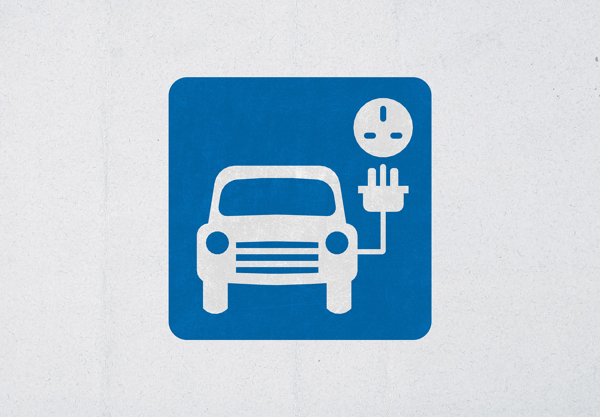
It’s understandable then, that subsequent icons designed for our road system follow her brilliant lead (however somewhat less successfully). Their quaintness is arguably very British, and the cost to update an estimated 4.57 million traffic signs is not worth thinking about, but when all-new icons are required, is the logic to design them to be more representative? A case in point is The Department for Transport’s EV charging point symbol (above).
EVs herald a bright new world of non-polluting (at exhaust) mobility, innovative modern car design and continued breakthroughs in automotive and charging technology. So, is a 1960s Hillman with a three-pin plug attached truly representative? Agreed, it’s successful for being easily understood, but is it a missed opportunity?
Sainsbury’s Smart Charge logo shows different connector types to highlight that rapid CCS2 charging and slower Type 2 are both available at their charging stations (their chargers have their own cables, so you don’t need to bring your own). This detail may be lost on many, but in its favour, the absence of a car symbol welcomes electric bike and van drivers.
![]()
Do you know your road signs?
See if you can guess what each road sign below represents, all the answers are further down.


Here's the answers (did you get them all?)
1. Migratory Toad Crossing (obvs!)
2. Diversion Route (follow the triangle)
3. No Vehicles Carrying Explosives (seems reasonable)
4. Emergency Telephone (I guess emergency phones still look like this)
5. Accident Ahead (these are usually displayed on Motorways)
6. No Motor Vehicles (not an invitation for daredevils)
7. Low Emission Zone (not very creative is it?)
Because I think The DfT's EV charging point icon is a missed opportunity, I couldn't help having a go at designing what I think it should be:

If you need some pure graphic design, whether it's a suite of icons, a brochure or a complete marketing campaign, take a look at our work and get in touch.
Or continue reading more of our blog.


