<img height="1" width="1" style="display:none" src="https://www.facebook.com/tr?id=998375496925788&amp;ev=PageView&amp;noscript=1">

Goods for Good.

White tee with KIND HUMAN and green heart logo

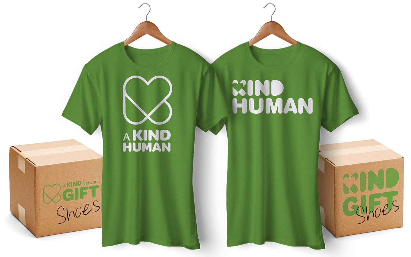
Inspiring human kindness.

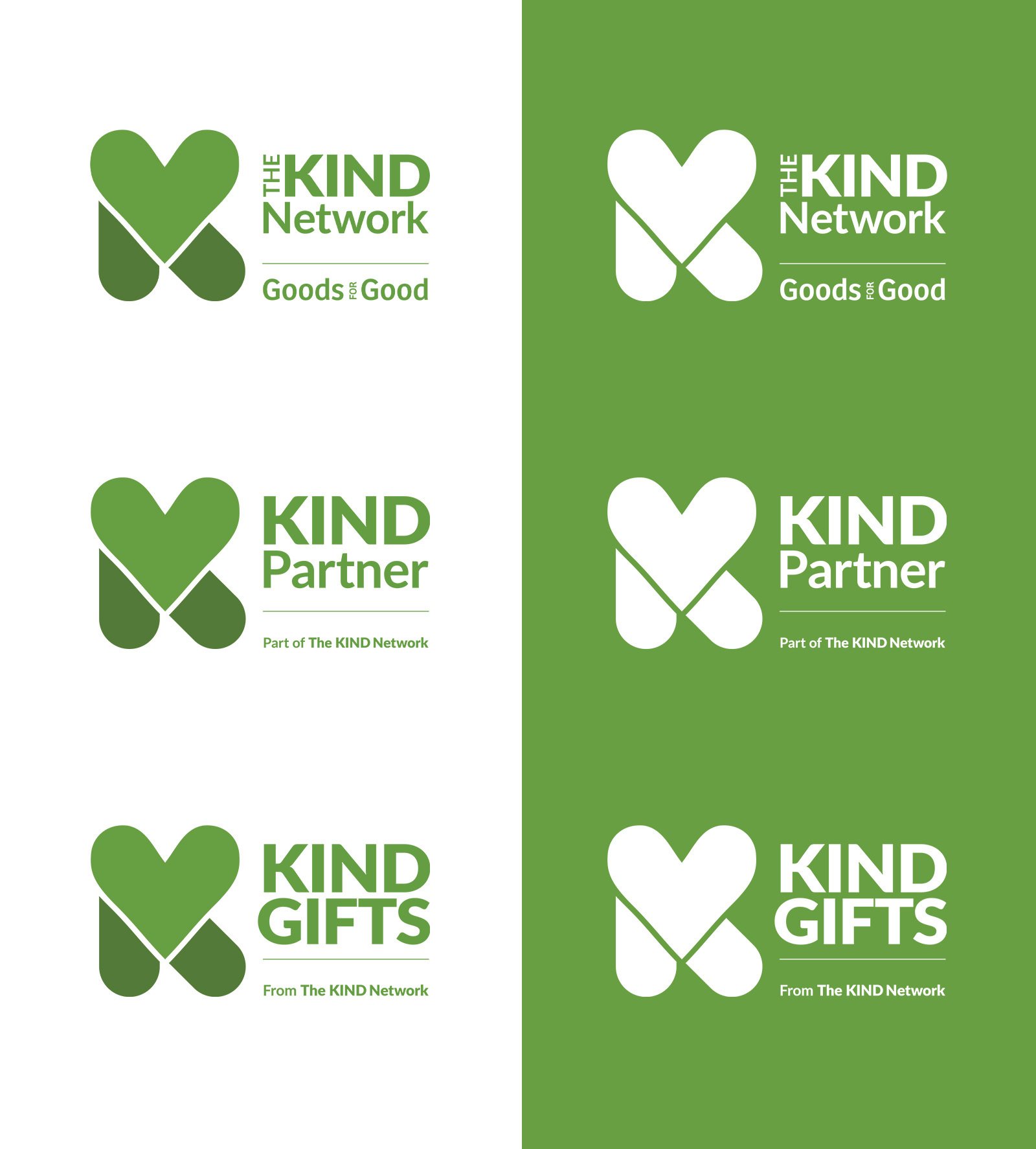
Goods for Good collects donations of new and nearly-new clothing, shoes and essential items, then distributes them to people in need around the world, including here in the UK. As their network of donors and distribution partners expanded, they recognised the need for something more than informal association. They wanted a recognisable internal brand for their partner community. A mark that partners could wear proudly and that external audiences would immediately trust.

This was about building a movement identity, not just designing a badge.

Listen instead?

Inspiring Human Kindness | Work | We Are Acuity
3:16

“We just loved our visit to We Are Acuity to brainstorm with them and hear their ideas on our theme of 'inspiring human kindness'.”

Rosalind Bluestone MBE

Founder & CEO

Goods for Good

Challenge

Goods for Good needed to create a credible, uplifting partner brand that could scale as the network grew. It had to work across different types of organisations, from corporate donors to frontline distributors, without becoming complex or fragmented.

At the same time, the charity was introducing membership fees to strengthen core funding. The partner brand therefore had to feel valuable and meaningful. It needed to carry weight, reinforcing the idea that being part of the network stood for something tangible and trusted.

G4G 1920x950 heart sketches

First, we sketched a LOT of hearts and explored ways to combine the symbol with kindness to create something unique. (above)

Insight

We approached the task as an accreditation challenge rather than a branding exercise in isolation. The opportunity was to create something akin to a trusted badge, where the symbol becomes shorthand for shared values and standards.

Instead of separating donors and distributors into different categories, we recommended unifying all partners under one inclusive identity. “A Kind Company” became the defining partner mark, sitting within a broader “Kind Network” structure. This approach simplified the system, strengthened the sense of collective purpose and avoided unnecessary hierarchy.

We worked up alternative options and demonstrated the designs in use. (below)

G4G Other ideas image

Solution

We developed a clear and scalable brand architecture: A Kind Network, A Kind Company and A Kind Gift. The structure created clarity while allowing the identity to flex across different contexts and communications.

Creatively, we presented four distinct identity routes, each rooted in the universally recognised symbol of kindness, the heart. By retaining Goods for Good’s established green, we ensured continuity with the master brand while giving the partner identity its own recognisable presence. One route was selected and refined into a confident, ownable badge designed to work consistently across digital platforms, printed materials and partner communications.


Goods for Good chose a version of the logo which merged our two worked up designs. (below)

G4G Kind Logos_v2

Results

The outcome is a clear, scalable partner-badge system that strengthens pride and unity across the network. Membership is positioned not simply as participation, but as a visible commitment to shared values.

The identity increases the perceived value of belonging, supporting Goods for Good’s funding model, while keeping the focus on the movement and its partners. Goods for Good is confidently positioned as the enabler behind the scenes, championing and connecting a growing community built on human kindness.