<img height="1" width="1" style="display:none" src="https://www.facebook.com/tr?id=998375496925788&amp;ev=PageView&amp;noscript=1">

Watford Town Centre

We rebranded Watford Town Centre

Rebranding our home town.

Watford’s award-winning Business Improvement District (BID) comprises of over 400 Watford town centre businesses which fund projects aimed at improving the town centre experience for visitors, and for the businesses themselves. This could be anything from funding and promoting the Christmas Lights, to implementing Watford's newest online business hub, connecting local businesses and helping them find out what's going on in the town.


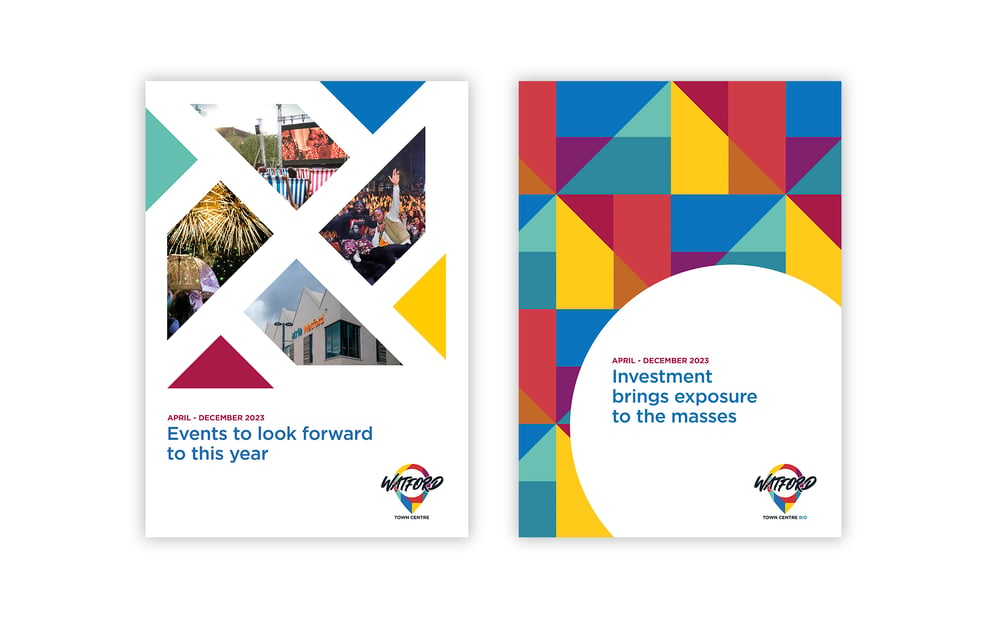
We Are Acuity has been working with both the business-facing and consumer-facing aspects of Watford (BID) for many years, most notably bringing a series of colourful and dynamic banners to the town’s busy streets.

“The rebrand is already a success in our eyes as the team and the board are all very pleased with how the new logo & branding appears.”

Glen Hempenstall

Marketing Manager at Watford Town Centre BID

Challenge

The idea of rebranding the BID had been part of our conversations with the organisation for some time. As the introduction to this case study shows, the concept of BIDs is not well known, and the consumer-facing and business-facing aspects can be confusing.


We believed that a more customer-focused approach, which clearly communicated why the BID existed and what it did for the town centre would bring many benefits: a single and consistent brand would be simpler to manage across all channels, and could be established as THE place to turn for information about Watford for visitors, residents and businesses.


The BID also believed that this change was needed, and we were delighted the rebrand project was given the green light.


The new brand would need to feel equally focused on consumers and businesses; it would need to be flexible enough to promote a celebration in the park or an event in the shopping centre, but also to update business owners on crime rates for example; and it would need to make a visual impact in every channel, from social and online to printed collateral and OOH banners.


And whilst the BID was familiar to local businesses (particularly those who pay a levy to be part of it), it was a concept that lived below the radar for consumers. They had soaked up the BID’s messages in the past, without needing to know who was delivering them. We had to be careful not to muddy the waters with the introduction of this ‘new’ body, and instead ensure a smooth continuation of helpful, impactful messages.


Insight

With our work across both previous brands, we had an in-depth understanding of the strongest parts of each one. We knew that the colourful approach of the consumer brand had struck a chord with the people of Watford, with banners and a pop-up art gallery all gaining good traction and helping to communicate the young, vibrant and multicultural energy of the town.


We also knew that the many stakeholders behind Watford Town Centre appreciated this approach too. The new brand would need to be agreed by a majority of these stakeholders (which included a diverse set of businesses from national retailers like Boots to smaller boutique businesses), so it was clear that this strong use of colour should form the basis of the new brand.

logo


Solution

The new modern and dynamic brand begins with its logo, which represents a location map pin. This concretely connects the brand to the physical location, helping to elevate the BID from an abstract concept into a something that represents, values and treasures the town. And of course, at its most basic level, this colourful pin puts Watford on the map.


Two subtle variations of the logo were produced to give the brand flexibility, the small difference being the addition of the word ‘BID’ to the B2B version.


The guidelines set out all the information about the new brand’s visual identity, and how best to use it in a range of communication for either audience. As an example, the guidelines explain how the colours that make up the logo were chosen to represent the vibrancy of the area. They then expand on this to create a geometric, repeatable tile that can be used to represent the diverse culture of the area, or ‘exploded’ to represent the businesses, venues, retailers and spaces in the town.

WTC_EGs copy


Results:

The new brand has been very well received, both by the stakeholders, and by the people of Watford Town Centre. The launch saw a full suite of social assets, email templates, press and OOH rolled out. Our friend’s at Wirebox also created a fantastic new website, which the guidelines helped to bring to life and can be seen here. All these assets show that our fun, modern and dynamic brand is the perfect match for the values of Watford Town Centre itself.


If you’d like to talk about your new brand or your brand’s local marketing why not schedule a FREE 30-minute assessment today here? It will be well worth your time.

Or alternatively read more about Local Marketing on our blog page "Local Thinking': https://www.weareacuity.com/local-thinking-our-blog